


Why stakeholders are ignoring your research share-outs? 4 Don'ts and 1 Do
It isn’t just about the content—it’s about how you share it. I see real-life examples (details altered) all the time and decided to write about them.

Making research outputs sticky isn’t just about all the rigorous work that goes into the content—it’s about how you share it. High-quality research projects fail to influence product direction and will be ignored if it did not catch your stakeholders’ attention in the first 3 lines.

No matter how good the quality, many insights fail to make it to the decision table because of avoidable mistakes in how they’re marketed to their audience.
Better marketing of research insights drives higher engagement
To maximise the likelihood that stakeholders will use your research outputs, focus on effectively socialising and promoting the insights. This process requires more than just time investment. It requires thoughtful approach to communicating and marketing your share-outs.
Treat stakeholders like you would treat your users by reducing friction in how they find, understand, and use your insights.
1. DON’T: Bury your insights amidst process descriptions
If your main findings are hidden behind a lengthy context of methods, background, and such, your audience may never get to them and lose interest.
What bad looks like

For context: What we call ‘value drivers’ are upsell and cross-sell products, services or activities offered strategically to consumers (e.g. vouchers, upgrades, and premium add-ons). Blah blah blah. Read more…
What good looks like
Start with the actionable findings.

3rd party providers refer to what we call ‘value drivers’ as ‘extras’ or ‘options’ which influences how they market and sell these services. here’s how we can align with their language to boost adoption. Read more…
2. DON’T: Skip the connection
Connected stories stick because stories can be remembered and retold. Disconnected information makes for forgetful information.
What bad looks like
Listing findings without a unifying thread:

Here is the new research project summary.
Key findings: Semi-pros are more productive and open to diversification than casuals. Hoteliers and guests have mismatched comprehension of ‘value adds’. For full report click here…
What good looks like

Here is the new research project summary.
Key insight: Hoteliers and guests speak different languages when it comes to ‘Value Adds.’ Guests desire personalisation, but hoteliers consider these unimportant and possibly ‘nice to have.’
Recommendation: This gap presents an opportunity to bridge perceptions through targeted education (for hoteliers) and marketing (for guests). For the full report, click here
3. DON’T: make yourself the star of the show
Describing how hard the team worked and how extensive the research strategy was does not help your audience use the outputs faster. It wastes their attention currency.
What bad looks like

We are excited to share the Asia expansion research update. The cross-functional product teams got together to prioritise this and make it happen in time for Q4 2024. the team interviewed 32 participants. Read more…
This introduction wastes valuable attention on logistics and framing instead of diving into the value for the audience.
What good looks like
Lead with the crux of the problem that matters to your audience. For example:

Q4 research uncovered three critical opportunities to improve partner retention in the South Asian market: simplifying onboarding, targeting semi-pro partners, and emphasising diversification.
We learnt, Read more…
4. DON’T: Mess up the hook and the net
Why are the juiciest findings often found after “Read more…”?
You wouldn’t want your customers to work that hard to experience the benefits of your product. Why do that to your peers?
What bad looks like
Starting with a generic or overly technical opener like:
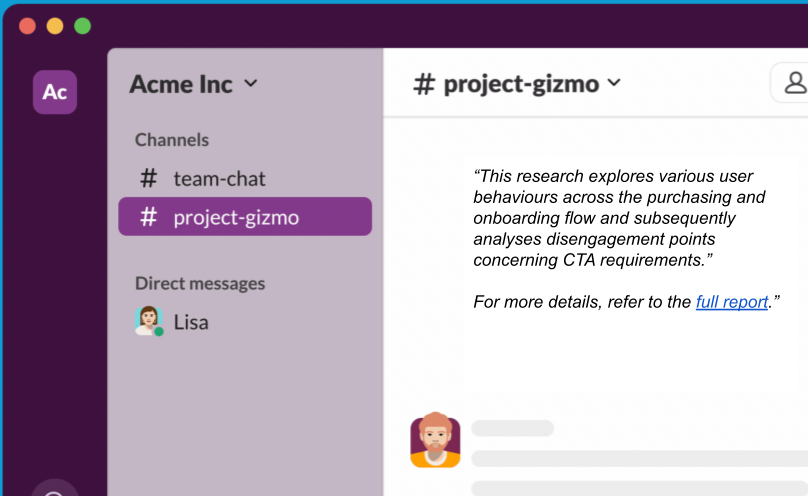
“This research explores various user behaviours across the purchasing and onboarding flow and subsequently analyses disengagement points concerning CTA requirements.”
For more details, refer to the full report.”
What good looks like
Hook your audience by immediately connecting your findings to their goals. For example:
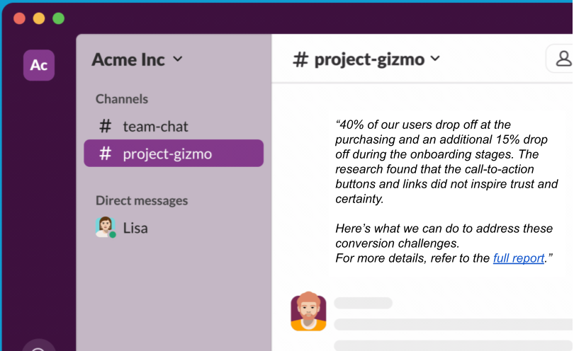
“40% of our users drop off at the purchasing and an additional 15% drop off during the onboarding stages.
The research found that the call-to-action buttons and links did not inspire trust and certainty.
Here’s what we can do to address these conversion challenges.
Read the detailed report.”
If you fail to grab them in the first few seconds (the hook) or don’t leave them with a clear, actionable takeaway (the net), your research risks getting lost in translation.
1. DO: Speak in human language
Language should be used to express, not impress. One of my favourite lessons from the IBM Design days is,
“Explain to me like I am a fifth grader.”What bad looks like

“Our research indicates that a statistically significant proportion of participants (35%) reported an inability to intuitively locate the CTA, which caused abandonment of the ordering flow.”
What good looks like

“35% of our users couldn’t find the ‘Place Order’ button easily, leading to dropped orders.
This is a big chunk of users that has impacted our revenue growth last year.”
Tl;dr: Don’t just inform. Influence.
Soma partners with organisations to design systems that help teams make user evidence led decisions.
If you want an advisor or a interim partner and want to see how I can help, get in touch.